Data Literacy Hope for 2023
2022 was a good year for continued progress to spread the word about how to use data better.
Last night, I wrote this on LinkedIn:
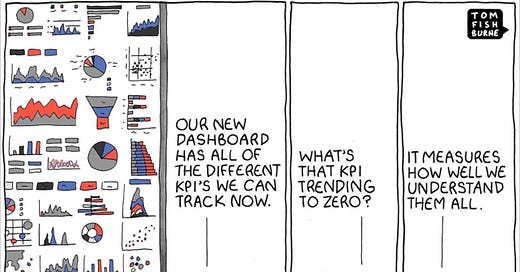
“This Tom Fishburne cartoon is making the rounds with depressing cracks like “this is why data dashboards should go away!” These misinterpretations seem negative, self-serving, and wrongheaded to me.”
Overnight, the post blew up -- 30,000 views and several hundred likes. Not Kim Kardashian numbers, but for a nerdy topic like data literacy, pretty good.
Why the passionate response?
I’d like to think it’s the message of hope about the rise of data literacy.
That is,
Dashboards don't suck; we just need continued systemic education about how to use data better. That's happening thanks to inspired work from the Storytelling with Data Community, The Data Leadership Collaborative, and the Data Visualization Society.
Analysts shouldn't go away; we just need more, better storytellers. Read the fantastic books by Brent Dykes, Cole Nussbaumer Knaflic, Steve Wexler, Janine Kurnoff and Lee Lazarus to get unconfused and inspired.
Data consumers aren't hapless and hopeless; they just need support and training from groups like The Data Lodge, She Loves Data, and diversity and training programs like Data Science for All by Correlation One.
Yup, there are lots of bad visualizations out there, but there's a ton of cause for hope that things are getting better thanks to these great people and organizations. So, here's my list of three books, three communities, three programs, and three TED Talks spreading the word and love about effective data use.
Happy new year!
THE BEST OF DATA LITERACY, EDUCATION AND MENTORING
Modal Learning has a mission to “empower every employee to do their best work.” by teaching critical technical skills through live cohorts and projects on Modal’s Mastery Platform. And I’m excited to announce that I’ll be teaching for Modal beginning in 2023!
Correlation One’s Data Science for All program is a great example of a program to help bring folks from underrepresented communities into the wonderful world of data, data science and analytics. It’s open to all, for free. Thousands have been trained with ZERO accumulated student debt. Adult learners are trained and mentored by experts in the data field. I’m on the advisory board of Correlation One and serve as their “mentor of program mentors” for the group, which is one of the most rewarding things I do.
The Data Lodge helps companies build data literacy and training programs to get more people to be literate and skilled with using on to make smarter business decisions.
THE BEST OF DATA STORYTELLING BOOKS


Storytelling with Data: A Data Visualization Guide for Business Professionals, by Cole Nussbaumer Knaflic describes storytelling techniques but aimed at business professionals and uncovering the story behind the story.
Everyday Business Storytelling: Create, Simplify, and Adapt A Visual Narrative for Any Audience, by Janine Kurnoff & Lee Lazarus makes you think twice even when you’re writing a simple email or the title of a Google Slide.
The Big Picture. How to Use Data Visualization to Make Better Decisions, by Steve Wexler from the first Tableau Zen Master, starts with a humble table of numbers to show how simply changing colors in a clever way leads to better understanding.
THE BEST OF DATA COMMUNITIES
The Data Visualization Society with about 20,000 members, the Data Visualization Society is vendor agnostic open community of data visualization professionals that runs the annual Outlier conference and the Information is Beautiful awards and celebration of great visualization work.
SWD Community is a place for data analysts and up-and-coming data people to hone data visualization and storytelling skills through practice, getting and giving feedback, and discussing topics related to effectively communicating with data.
The Data Leadership Collaborative is a community aimed at educating senior-level leaders in data, covers CEO / CDO / CAO-level topics like regulation, culture, building communities of practice, and more.
THE BEST TED TALKS ABOUT DATA
The Best Stats You've Ever Seen. Raw. Funny. Interesting. If you haven’t watched this TED talk by Hans Rosling, put it on your list. The review from TED: “With the drama and urgency of a sportscaster, statistics guru Rosling debunks myths about the so-called "developing world.” I liked the example so much I made a movie out of it:
The Beauty of Data Visualization - David McCandless. Turning complex data sets into intuitive diagrams and utilizing good design that change the way we see the world.: “Design is about solving problems and providing elegant solutions, and information design is about solving information problems.”
Three Ways to Spot a Bad Statistic —Mona Chalabi, data journalist. “Sometimes it's hard to know what statistics are worthy of trust. But we shouldn't count out stats altogether... instead, we should learn to look behind them. In this delightful, hilarious talk, data journalist Mona Chalabi shares handy tips to help question, interpret and truly understand what the numbers are saying.”
What is the Business Value of Data Visualization? — by me! (Mark Palmer), based on work by Steve Wexler. Best-selling author Steve Wexler shows that good visualizations can deliver six times more business value than basic ones. In the Data Leadership Collaborative, the Wexler Test shows how small changes to a naive visualization can yield 5 times faster answers with greater accuracy. I turned his article into a YouTube explainer:
These resources, programs, TED Talks and communities are proof positive that, although we may have a long way to go to achieve data literacy for all, we’re making a lot of progress through the generous work of a lot of fantastic people.


Here's the post on LinkedIn where you read the comments: https://www.linkedin.com/posts/markwpalmer_datavisualization-diversity-datascience-activity-7013275149252583424-VQ3X?utm_source=share&utm_medium=member_desktop